Bad Kerning and Ligatures in Embedded Fonts with Google Chrome
I recently decided to try out the Google Chrome web browser, mainly because of occasional Firefox crashes (that happened even with no extensions loaded). Impressed with its speed, I stuck with it, and it’s now my default.
But a recent article inspired me to look more closely at Chrome’s display of type set in fonts included using the CSS3 @font-face directive. I found that Google’s speedy browser does a poor job in comparison with Firefox.
Here are two examples from a page [gone now] that helpfully demonstrates the display of 10 very nice free fonts.
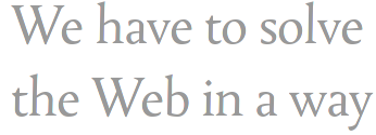
 We know that the letter-shapes shown by Firefox are probably the correct ones because the authors of the page have supplied a link to a screenshot showing what the page is intended to look like. But the screenshot also has a broken ligature and no or very poor kerning, and, as they mention Safari, there is a reasonable chance that the screenshot is taken using that browser. Safari uses a version of the Webkit rendering engine, as does Chrome, so it seems as if the ligature and kerning problems might be traceable to that.
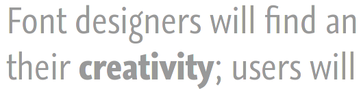
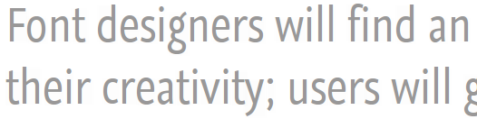
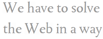
Below is a demonstration of the lack of kerning in Chrome: note the unsightly gaps between the Ws and es. The Firefox screenshot below that is an example of correct kerning.
The article that got me looking at these examples of type rendering is entitled 24 ways: Real Fonts and Rendering: The New Elephant in the Room. The elephant is supposed to be differences in rendering between platforms, amounting to poor rendering on some, caused by differences in font hinting. But here, as elsewhere, there is a much larger elephant that looms over the handling of text in web browsers, one much bigger than the details of font hinting, and one that will not go away as display resolutions become finer. This is the fact that all browsers handle text in a primitive way akin to word processors, and this makes the discussion of “aesthetics” in regard to type on the web by web desginers quite premature, if not a little silly.