Gapminder World Chart for 2006
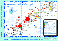 This beautiful chart compares the world’s territories by income and infant mortality as a proxy for “health” on a log-log scale. The correlation between wealth and health is striking, with interesting outliers: sprinkled below the main straight line, indicating a larger infant mortality than other nations with similar economic resources, are several African countries, such as South Africa, Angola, and Nigeria. Floating above the line are countries that have managed to achieve lower infant mortality than others with similar wealth: Cuba, Sri Lanka, Malaysia. What are these countries doing right, and the African countries doing wrong? Is it just the hazards of their respective environments? Note that the U.S. is near the central cluster, but distinctly at its bottom edge, a mediocre performance compared with Japan and most of the E.U. Where would the U.S. fall if you excluded its immigrant or minority populations, or only included them?